Urban Monkey Cafe’s New Tasty Website
Thursday, December 08, 2022 by Enamul Hasan Ismail

Urban Monkey has been serving fresh wholefood, killer coffee, wholefood smoothies in Bundall CBD since 2015. We developed a tasty and fresh website to match their philosophy. You can visit Urban Monkey Cafe here
Auswide Sheds and Garages Launches New Website
Tuesday, November 15, 2022 by Enamul Hasan Ismail
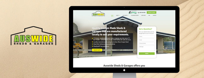
Auswide Sheds & Garages Pty Ltd is a proudly 100% Australian family owned & operated business specialising in the supply of quality Australian made Steel Sheds, Garages, Garaports, Carports, Barns, Farm and Industrial Sheds nationwide. Our team worked very closely with Auswide Sheds & Garages to create an online presence that showcases their products and services to their ideal audience.…
We Welcome Pimpama City Shopping Centre on Board
Wednesday, September 07, 2022 by Enamul Hasan Ismail
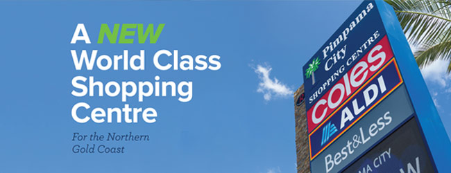
We are honoured to be commissioned by Pimpama Shopping Centre to be their digital partner to manage their online digital presence. We are excited to work with Pimpama City Shopping Centre Management on many exciting projects. Keep an eye for more exciting updates!
Bird and Young Group Corporate Online Presence
Wednesday, August 10, 2022 by Enamul Hasan Ismail
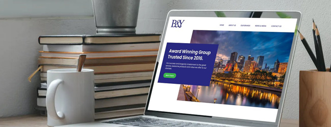
We were commissioned by award winning group, Bird and Young Group in Melbourne to craft their corporate online presence to showcase their world class digital projects. Please visit their official website.
Coast Life Constructions Qld – New Branding & Website
Friday, July 08, 2022 by Enamul Hasan Ismail
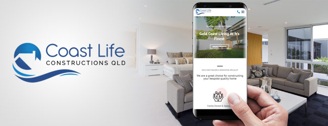
The team at GCDS had great fun crafting the new branding and online presence for Coast Life Constructions Qld. Please visit their official website.
Coronavirus Relief Digital Marketing Packages
Saturday, May 30, 2020 by Enamul Hasan Ismail
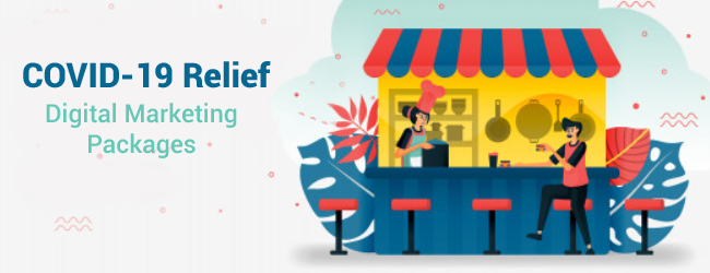
To help small business owners to weather this pandemic, we have created a number of Digital Marketing Packages, with prices starting at only $65 a week..a massive 50% off savings from our usual pricing. Call Kerry, our client manager on 0419 764 862 for a free consultation and we will advise you on the following; Analyse your business needs Provide…
Award-Winning Media Agency Engages Gold Coast Design Studio
Thursday, May 14, 2020 by Enamul Hasan Ismail

We are honoured to design and develop a fresh new online presence for Melbourne based media agency, China Social Solutions. Please visit their official website.
Seamless Shopping Experience for Max Solutions
Wednesday, April 08, 2020 by Enamul Hasan Ismail

We have developed a seamless online shopping experience for one of largest employment providers in Australia, Max Solutions. Our solution allows employees for Max Solutions to order their uniforms online driven by seamless backend integration. Max Solutions deliver life-changing opportunities with positive outcomes for both individuals and employers.
Elegant Presence for Rosa and Mary Bridal Shop
Thursday, February 13, 2020 by Enamul Hasan Ismail

The GCDS team has developed a sleek and elegant presence for Rosa and Mary’s Bridal Shop, one of the most popular bridal shops on the Gold Coast. You can visit their bridal shop website here.
Diamond Boulevard – A Diamond Spectacle
Thursday, January 16, 2020 by Enamul Hasan Ismail
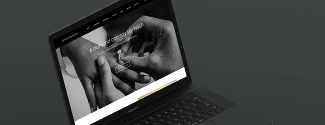
We have developed a new online presence for one of the most popular Diamond Jewellers on the Gold Coast, Diamond Boulevard. If you are looking for a high end diamond jeweller, please visit Diamond Boulevard.